This year, I was (un?)fortunate enough to visit Copenhagen and watch the Eurovision Song Contest, performed live.
However, like every recent year, the voting system was clearly skewed by countries voting for neighbours / political reasons.
I really wanted to see some sort of map of the Eurovision results, to see what these "political" votes really looked like - but unfortunately, nothing I found even came close to what I was hoping for. Well except for maybe this map, which is at least interactive but with fairly limited scope...
Everyone else seems to have either already done the analysis for you and presented their results, or displayed the raw data in an ugly way!
So, I decided to make one myself. This is, by far, the most interactive Eurovision map I've found on the internet. Compared to this map, for example, everything seen there can be achieved by clicking "To country", "2014" and Austria. Here's what I made:
In case the colour scheme is confusing anyone:
Yellow = Selected country (if applicable. You cannot select non-participating countries, or countries that voted but did not sing, when in "To Country" mode.)
Grey = The country did not participate.
Pink = The country voted, but did not compete (in the final). So of course, they did not receive any votes - hence I've given them a special colour when in "From Country" or "Final Score" mode.
Red --> Green = Lowest --> Highest ranked. In the case of "Spearman Ranked" mode, this is supposed to mean "worst --> best at voting fairly", although this statistical analysis doesn't work as well as I'd hoped, yet...
Rather than simply telling you what I think, I'll let you click around and come to your own conclusions.
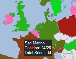
San Marino is there, I promise ;)
 RSS Feed